Friday, April 22, 2011

Postmodern

Modernism efficiency and communication

Post-modernism

Pluralsim 

ironic

dualism

Post modernism
Used to note a break with the earlier modernist principles by
placing emphasis on form over function, by reintroducing
traditional or classical elements or by carrying modernist styles
or practice or extremes 

Seen in art design literature architecture

Emphasis on feel rather than rationale 

Emphasis on surface texture and materials

Self conscious and self referencing 

Mixes high and low

Historical reference 

Vernacular 


Wolfgang Weingart


Memphis design group
function secondary to style

Situationist modern dada

Paula Share

Charles Anderson
changed the language of packaging by appropriating vernacular 

Peter Seville

24 hour party people

Von Oliver

Mac shifts aesthetics

April early adapter of computer

Catherine McCoy // Cranbook

David Carson

Sagmeister

Postmodern - more powerful better communication / isnt that modern goal?

mixing high and low

Chip Kid - Choose monkeys

Paula Share


I think that the majority of art being produced today tries to be clever or ironic. I also see a lot of paradoxes like cute things being violent // opposing ideas that don't belong together, and know they don't belong together. I wonder what the future will see when it looks back on Postmodernism. I don't know - I think post-modernism is fun but I think it usually comes off as shallow having more about style than substance. Maybe its a product of globalization where there is so much competition you have to be the most clever. Artists like Bansky take the focus from the content to the artist. To me it says, "look how clever I am." Thats my opinion on the general idea of post-modern.


Bauhaus

Bauhaus  1919 - 1933
Locations:
Weimar 
Dessau
Berlin

Utopian desire to create a new spiritual society

Unity of Artists and Craftsmen to build for the future

Ideas from all of the Advanced Art and Design Movement were explored and applied to functional design


Maholi  Prescribed done year to year

open ended

1923 - first exhibition

Jan Tschichold
-1925 publishes book on typography "The New Typography"
-The aim of every typographic work is to deliver the message in the quickest shortest way

Elbert Hubbard 

Wiener Werkstatte


In what way is Jan Tschichold

Helping propagate ideas for practical expression 

Herbert Matter
-Switzerland
-pioneered photo montage and defined what the modern poster can be 
-extreme perspective shifts scale shifts
-very clear concise efficient 

modernism filters in slowly

Lester Beal
-arrows, bars
-Rural Electrification Administration
-new deal

-limited palette popular easy to produce

-WPA posters use silkscreen a lot
-and seriagraph

Container Corporation of America

Ladislav Sutnar

International Style
looking for universal truths

I enjoyed learning about the Bauhaus, before this I had heard about it and even seen pictures of the school but never really knew too much about it. Its amazing how many times the school was attacked by the public and the Nazis. I admire that they stuck around as long as they did. Its interesting to me how ideas are recycled like looking back to the gothic cathedrals. I enjoyed the work of Herbert Matter. I liked his clean, dynamic compositions that mixed photography but in a minimalist way.  Also liked Lester Beal.

So, this class was just an introduction to many artists that I will be looking at and discovering for a long time.


Tuesday, April 19, 2011

HAHAHAHA IM ALIVE

Day8

El Lissitsky - proun
-its propiganda, its fuctional

suprematist - should be purely emotional not functional

constructivists

photography- modern way of creating art
montage - Eisenstein 
layering images, cutting sequences  to create
The Battleship Potemkin

Alxander Rodchenko
-Penultimate contructivism
-contructiviism the only true art has function for the people

De Stijl
-utopian approach to aesthetics 

-Rectilinaer planes
-void of surface textures or decorations except pure hues
-mathematical structure

Theo van Doesburg - founder of De Stijl

asymmetrical composition 

Mondrian 

HAHAHAHA IM ALIVE


For me the De Stijl work we saw is boring. I think if you reduce something so much it loses its idiosyncrasies that make something interesting. The Suprematist and Constructivists made interesting work. Dorian talked about them like it was so obvious what they were for, but for me they were a little ambiguous. Such as the kid throwing up cookies or a guy with nails in his mouth. Visually I think they were beautiful but I feel like reduced work is only good if it is in contrast with what is going on around it. So what Im saying is if everything was stark geometric shapes, everything becomes the same. Thats my story and Im sticking to it.

Tuesday, April 12, 2011

Its More Than Just Grids

Its more than just grids

Visual unity achieved by asymmetrical organization 

objective photography

sans serif type

flush left
rag right

mathematical grids

its socially useful 

distichil asymmetrical grids

Peter Behrens

contructivism making things that are useful

Bauhaus making things that are useful in the home 

Swiss design - The International Typographic  Style
More important than the appearance is the attitude
Design is socially useful


Max Bill died 64
Theo Balmer died 94

students of the Bauhaus
provide link post world war ii swiss design

grid informs or becomes the art

the answer is in the problem - 

Max Bill involved in planning  the ulm
inclusion of semiotics

semiotics - what things mean in relation to other things

Syntactics - order
Semantics - meaning or referred to
Pragmatics - how it is used

Adrian Frutiger
The univers alphabet

Armon hoffman
if you design the negative space the rest will work

Joseph Muller Brockman

European Modernism is theoretical 

Paul Rand

Saul Bass - title sequences

Ivan Chermayeff 


Cut Paper its quick  immediate 

tactile
immediate

Ivan Chermayeff

Paul Rand is cool. I found out today that I don't like artist who begin to stick to one approach for all their work. To me it becomes stale and boring. Its as if they learned how to work one way but then it becomes some sort of dogma. I wonder if a designer should have a personal style like Paul Rand or some of the other people we have seen// or should a designer be invisible and use the style that is appropriate for the project. Again, I like Paul Rand's work but I wish he wasn't so visible when you see one of his ads or something. At this moment I feel like a designer shouldn't draw attention to himself. It reminds me of all these posters that have come out about the Japanese earthquake, its more about the designers than the situation. I don't know I have to think about this...

Friday, April 1, 2011

Bauhaus

Bauhaus

1919-1933
starts in Weimar
first public exhibition 1923
1924 Letter of Resignation / persecuted
1925-1932 Dessau
1928 Groupius replaced by Meyer
1930 Meyer replaced by van der Rohe
1932-1933 Berlin


Area economic depressed put art school

Walter Groupius
Cathedral
(john Ruskin mentioned it)
Groupius uses cathedral as three spires 
painting 
sculpture 
architecture
allegory - a new social unity

Gerhard Marks - Sculpture / Pottery

Lyonel Feringer - Painting

Johannes Itten - Preliminary Courses


Foundation class - study based on contrast
Analysis of old masters

Found object structures
Analyze forms
Something that is hard should CONTRAST something that is soft

Itten leaves 1923 
Bauhas leaves craftsmanship medievalism moves towards design thinking

Bahaus Poster
art and technology
Cubism Deschilt Supremitsm

1923 first exhibition of Bauhaus

Itten replaced by Laszlo Moholy Nagy
scientist, photo montage, resin

type-o-photo
replacing painting
new visual language for new age

(Luscian Benard did something similar - plachenst...)

photo-plastiques
new pictoral expression

1926 building glass curtain windows 
modern building


universal alphabet
doing away with capitols

did away with serifs
experimenting with raging to the right
contrast and hierarchy
bars rules squares and open compositions on implied grids

dominant vertical dominant horizon

"less is more" - Ludwig van der Rohe


Learned about the Bauhaus today...
The designs don't look that dated compared to the other stuff we have seen. Its a shame the Nazis shut them down. Boo Nazis. I prefer the Bauhaus approach to design than Art Nouveau.
It was interesting to see that they not only did graphic design but also dance, sculpture, furniture, pots. I think it continues on the ideas of William Morris, that anything can be designed. Today artists specialize in something so specific that we miss learning about other crafts. It benefits knowing outside our field because we often must collaborate with each other. Walter Groupius's idea of the cathedral also goes back to what we learned earlier about Morris. I guess the main lesson I will take away from History of Graphic Design is that we all build upon what others did before us.


Tuesday, March 29, 2011

What I know about Bauhaus

The Bauhaus is a cool building in Germany and its a design style...

That is all.

Ooo  and its a cool band from the 80s. Ha

Thursday, March 3, 2011

Russia is chill, brrrr

Day 07

Cubism on design

Ludwig  Hohlwein
-german poster designs

Edward McKnight  Kauffer
-ideas of cubism applied to design
-generous use of negative space

Analytical Cubism 
-early phase, new ways of understanding space

Synthetic Cubism
-Picasso making collages

Adolphe Mouron Cassandre
-abstraction

World War I
-people looking for logic systems, universal truths

Dubonnet 
-perfect??  , Dorian suggests godlike
-wordplay
-text and image work cohesively

Prior to World War I
-waves of unrest among workers all over the world
-especially Russia

Russian Revolution

universal truth - what do i believe maybe i can make other people believe


Russian avant-garde
1.Cubo-futorismo
2.Suprematism
3.Constructivsim

Work made of scraps, cut and paste
book made out of wallpaper cut-out


Kasimir Malevich
-Suprematism reflects utilitarian function
-no pictorial representation
-painting be spiritual not pictorial
-1915 red square

Constructivism
-the only meaningful art have function and things that have function are therefore art

Vladimir Tatlin
Rodchenko
El Lissitzky

renounce art for arts sake
art should serve the communist party

Lissitzky
-helps pioneer suprematists  but then works on Constructivism, bauhaus

Different guys:
Kandinsky 
Lissitzky

prun  ??
intersection between painting and architecture

beat the whites with the red wedge

-black bars
-page structure grid
-early expression of modernist
-asymmetrical, balance, san serif

How do you create meaningful art for the proletariat ?
Will good art be understood by proletariat?

I had a class about the philosophy of art. We learned different philosophers' philosophies (heh heh) about what is art, and they all varied widely and yet all made sense.  I think the question, "what is good art" is a hard question to satisfy because its based on opinions; but some philosophers say you can quantify it by the rules of beauty, and harmony. The greeks divided art into Apollonian art and Dionysian art, which were civilization and primitivism, respectfully.  So I don't think there is one answer for something so ambiguous we call "art". I think its more of a compliment given if it transcends what it is. I think good art is good at communicating something relevant so, I believe it should be understood by the proletariat if that's who its aimed at.

To create meaningful art for the proletariat I think familiar elements have to be used to communicate in a way that is familiar enough to come across effectively. For example, it would be infective to use an obscure literary reference to an illiterate population. Yet some people may like the ambiguous nature of unfamiliar subject so it doesn't necessarily make it bad art. I guess in the end you just have to experiment and if it works, it works...  And when you die someone will call it good art.

Thursday, February 24, 2011

Corporate Identity

Glasgow school - England
Vienna Succesion - Austria


Joseph Hoffman

Mussieur

-Make things that are useful
-showroom
-marks- sense of proportion and weight
-geometrical yet lyrical


Peter Behrens
-end of career  work is more commercial
-first use of running text san serif
-early advocate of sans serif typography
-credited with first comprehensive identity program
-pioneered non-load bearing walls

-associated  Mies Van Derrohe   and  Walter Gropies
first director of Bauhaus last director of Bauhaus respectfully


-Celebration of Art and Life
-recliner, abstract forms
-experimenting, sans serif becoming more blocky
-1903 becomes director of Kunstgewerberschule school

-1904 guy joins faculty, his thing is geometry
teaches composition based on geometry

-grid system
-1906 exhibition pavilion Peter Behrens uses that system
-1907 Behrens is made artistic director of AEG power company

-metaphor, honey comb, divisions of labor

three lynch pin components:

logo

type face

consistent layout


Underground Railway system


AIGA


Luscian Venard
-competition design for Priester matches
-plaketstiel
-poster style
-flat background, product and name


Julius Krieger
-war bond poster


The axis more graphic
The Allies use of illustration and information

touchy fealy
saccharine tastes


MOVIE
-The 1900s The Seeds of Progress
-Thomas Edison
-Henry Ford introduces mass production
-1901 buffalo exhibition
-electricity, light, engineering,
-Roosevelt considered progressive "square deal"
-muck rakers - the press, large exposes
-Uptain Sinclair - The Jungle
-Hull House in Chicago
-Jane Adams
-Mother Jones Carrie Nation - axe and chop bars into pieces
-Tourism
-Postcards to promote good natured envy
-Books for children became popular
-Wizard of Oz
-Nickelodeons  became popular
-The great train robbery, based on butch cassidy
-scott joplin maple leaf rag
-1901 phonograph records
-the fabians reform


I see connections between Peter Behren's corporate identity system and the rise of manifestos, corporations, and a growing global consciousness. The clean economical systems of mass production steered design into new clean, bold designs to stand out from the crowd. I didn't really like the grid systems that Dorian showed in class. I think that they were taken too literally and I found the designs unappealing and uninspired. Also the ideal of having hand-made objects in the home has changed to having well designed pieces in the home such as Behrens stove pots.

Thursday, February 17, 2011

Rudolf Koch
Germany
-interested in ideas of William Morris
-believes alphabet human kinds greatest achievement
-pinnacle of German typography
designed:
-Neuland (used for Caribbean and African things)
and decals and tattoos  used by minorities

Art Nouveau
-younger artists take ideas of beauty and craft but mix with sex, etc

Jules Cheret
- father of modern poster
-early work: uses tromploy effects, theatre, entertainment speaks to middle class
-known for later posters, more related to gibson girls
-central female figure surrounded by elements and typography set around that
-contemporary of Toulouse Lautrec

Rival:
Eugene Grasset
-heavy line and flat panels of color (coloring book style or woodblock style)
-interest in eastern art, particularly block printing

Reductive styles are going to be more important to us


Arthur Mackmurdo
-century guild chair 1882
-whiplash lines, sensual lines
-high contrast
-chair crafted
-did magazine called Hobby Horse
printed 1880s, shows British arts and crafts to a larger audience

manifestos, people begin to band together

-another popular magazine was The Studio

Aubrey Beardsley
-edited by Walter Crane
Aubrey Beardsley  does own illustrations for Morte d'Arthur,
-becomes famous by twenty // infante terible
influenced by Morris, Morris thought he had vulgarized the kelmscott style

Yellow Book
-symbol of outrageous
-victorians shocked by celebration of "evil"

Alphonse Mucha
-starts as illustrator born in Czech
-moves to Paris
-finds work working in a print shop
-1894 christmas eve, coworker wants day off
-Sarah Berghoff needs rush job
-elongated poster, practical choice
-less detail at bottom // ran out of time
-stylized reductive forms, plants, flowers, elements of folk art, byzantine, tiles, magic, occult
-whiplash tendrilsof hair
-pattern in background common device


pattern design very popular

Manuel Orazi

General Electric - art nouveau

Harpers Magazine
-hiring european arts
-cover printed in Paris

>>riffed/ stole<<

Louis Reed
-leading american art nouveau, embraces Eugene Grasset but also bright colors

William Bradley inspired by  first Morris then Aubrey Beardsley
-The Inland Printer
-1895 photo mechanical technique
-1898 Bradley,  his book - big ego


Popular illustration
Poster promoting harpers
Harper's illuminated bible

style evolved 1894
reductive style

Lippincotts competing magazine
asian motif, flat shapes

Pensville illustration


Henry van de Velde
-painter designer, architect
-Japanese and art nouveau

Henri Privat-Livemont
-inspired by Mucha

Jugendstil- Art nouveau in german
-Youth style

Peter Behrens
-member of Jugen
-the kiss
-whiplash lines, sensuous line, androgyny

its fun, young - art nouveau
becomes increasingly reductive
because of influence of asian design


leads us to Glasgow School
-Francis and Margett McDonald
-Herbert McNair
-Charles Renee McIntosh
-students 1890s

-geometric
-curvilinear elements
-rectilinear structure (rectangular)
-symbolism
-stylized forms

Talwin Morris
-book spines
-takes ideas of art students and commercializes

Austria
Vienna Secession
-Secession, austrian  art nouveau
Gustav Klimt
Koloman Moser
Josef Hoffmann

-not concerned with legibility, concerned with the surface the aesthetic
-Magazine Yer Sacrum
-1898

Its  interesting to learn about Art Nouveau, I've always been interested in it at a surface level. I see the connection between this stuff and what William Morris was doing. Its just that Art Nouveau is so much more sexy than William Morris. I also love poster design and this is such an iconic time for posters right now. Of course love the Mucha, who doesn't? From what I understood in class, students took the design ideas of Morris but then massed produced them in magazines, posters, etc. Kids is crazy.

Thursday, February 3, 2011

William Morris

William Morris continued,

Jenni Morris invalid, "water treatment"
Morris and company wallpapers - still used today
old style dyes
tapestry , hobby of sorts
Arts and crafts movement
John Ruskin - how can we restructure society
People start having Utopian ideas
rejects mercantile economy
union of art and labor - your works should be in service of society
!!gothic cathedral!! - artisans and craftsman come together
Bauhaus also point to the cathedral
John Ruskin is philosophical leader
machine is bad then logic says the hand is good- return to the medieval

Morris tries to implement the ideas of Ruskin in the factory
how can a worker find joy once again in their work

Flaw - Hand made crafts are more expensive

resurgence in book arts as a reaction to industrialization (Fredeck Gaudie)

John Morris designs:
-Golden used to print The Golden Type
-Troy black letter
-Chaucer (smaller version of Troy)

establishes Kelmscott press

Art Nouveau driven by young people influenced by the arts and crafts movement

Bruce Rodgers type designer, rejected modernism, revered book designer
The Roycrofters – group of people started in 1895 by Elbert Hubbard
Was American expression of arts and crafts - is more pragmatic
this happens time and time again


Although it doesn't make financial sense, I admire the idea of the arts and crafts movement. I think there is a place for both the hand crafted and for assembly line products because people have different values. It would be impractical to have everything be hand made, the other side to that is manufactured goods can be too impersonal. What I also admire William Morris for is the variety of work he produced, that is something I would like to apply to my career. William Morris's story makes me ask hard questions of my life. Things like what do I value? Will being engrossed in my craft make me happy or in the end will it mean nothing, pushing people away. Happy thoughts like that, maybe Bauhaus will be more cheerful  :)

Thursday, January 27, 2011

Day 3

Industrialization  


-1800 first iron printing press
-press can be cast and fabricated thus more durable 
-gear system = greater force with less human power
-in 10 ten years steam powered presses 400 sheets an hour as opposed to 250 sheets an hour
-4 years later double cylinder steam press 1000 impressions an hour 
-Ned Ludd rebellion in England against technology / losing jobs
-Nov 1814 London Times printed by steam powered press, had to be done in secret
-Papers become popular
-Newspapers sold by subscription (6 pennies?) as opposed to penny papers 
-Newspapers start selling ads ,  titles of enlightenment for penny papers The Sun, etc
-1841 John Guber becomes first ad man, starts first ad agency 
-First ad men were brokers of space, not designers
-Ottmar Mergenthaler 1856 invents linotype machine
-linotype does the work of 7-8 hand compositors

-Victorian era graphics
-Aesthetic confusion 
-Strong religious moral beliefs 
-loved fussiness 
-rise of middle class , more disposable money
-influence coming from the east
-decline in quality of craft 

"Title page from book"
-Letterforms are blackletter "calligraphy"
-Floral decorations
-Border

Lithography and color lithography
-wood type hits peak 1860s
-1796 stone printing
-chromolithography begins in Boston in this country

ephemera
-printed or written elements that are no meant to be collected
(movie tickets, posters, dime novel) 

-scrap cards printed on chromoliphic presses 
-Prang father of scrap cards
-used as premium for box of oats for example
-no color images in homes

victorian aesthetic 
-freshed face idolized children
-pattern work
-exotic animals
-illusion of depth Trump Loy?
-promote entertainment

-great sense of nationalism emerges 
-packaging emerges, tin
-chromolithography allows us to paint on metal
-development of american food culture
-Quaker oats 
-American Cereal Company
-Personalities in products
-Aunt Jemima, Uncle Ben
They are replacing shopkeepers 

-Popular magazines
-mid 1800s Ladies Home Journal 
The Practical Housekeeper
will not endorse products > figured out placing an ad creates a relationship by juxtaposition / stroking viewers subconscious 

-gibson girls

-reductive style is akin to abstraction
-easier for production 
-using scale for depth
-toy books are entertainment for children  Walter Crane's Absurd ABC
-Walter Crane, Randolph Caldecott, Kate Greenaway -( generous use of white space is atypical)

-Harper's 
illuminated bible 1600 woodcut illustrations 
Harper's Bazaar, Weekly, etc

Thomas Nast 
-father of american political cartoon 
-Uncle Sam
-Donkey Elephant
-Santa Claus
-Colombia

Boss Tweed running New York
-corrupt politician 

Movie
-Boss Tweed provided orphanages, jobs, coal stole 50 million dollars 
-1870 had more power than anyone in New York's history
-1870 unfinished county courthouse
-1869 Thomas Nast began publishing political cartoons in Bazaar's Weekly of Tammany Hall Ring 
-Tweed took the fall for corrupt system 3 counts of fraud 220 misdemeanor 
-1875 escaped to Spain - Spanish police recognized him from political cartoon

-Bicycles invented 

Heinz
-5th and 23rd beginning of lighted displays  - flatiron building
-1869 Henry Heinz sells horse radish, pioneers corporate image, branding
-giant pickle
-monument to labor
-provide workers with company store, hired attractive young women, had swimming pool and tanning deck
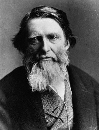
John Ruskin
-social revolution, philosophical leader
-order the lives of society so most people are happy and satisfied
-the manifestos start popping up
-beautiful things are valuable just because their beautiful  


William Morris
-father of arts and craft movement
-inspired by writings of John Ruskin
-both are sons of wealthy merchants

Movie 2
-never like trains
-designed wallpaper, wrote 90 books, cut woodblocks, poet, etc.
-make world beautiful against ugly industrial revolution
-born 1834 eldest son
-Dante Gabriel Rossetti important figure
-pre-raphaelite 
-Jane Burden limited education, wife
-Red House firm of decorators

     Newspapers and magazines enter the picture. The visual language is very conservative, much like how the internet developed. Its interesting to draw parallels from this time period to the development of the internet. Watching the development of ads and branding is like seeing different ways people schemed to sell things. Very psychological and still applies today. I wonder if ad agencies use more advanced strategies on consumers or if its relatively unchanged? Also, now I know the difference between the Rococo design aesthetic and the Victorian. Couldn't tell them apart before today. People just bought cheap crap. Reminds me a lot of Wal-Mart and how they are wiping out small businesses.

      It was also interesting to find out how Heinz campaigned his brand effectively, he seemed to be ahead of his time. I thought companies started doing this in the 1940s, or as early as the 1920s. I'll have to investigate further, when this idea of branding took off.

     I had forgotten about Thomas Nast, so it was a nice reminder. It definitely applies to my field, knowing who started american political cartoons. And its an awesome example of how much influence images have on people. 

Tuesday, January 18, 2011

Class Numero Two

- Fall of Rome
- Crusades, printing and paper developed

-first book printed in English, Recuyell of the Histories of Troy 1475

-1465
 Sweinheim  and Pannartz
 Guys from germany sent to Italy by Cardinal Giovanni of Turrecremata
 Blended Gothic minuscule forms with elements of Carolingian
 Produced half Roman type based on humanistic Italian round letter forms

-Calendarum 1476
 tidbit -  special thing in book

-Steven Day brings printing  to colonies in 1639, buys charter and  sets up a printing shop
 and prints a  book of psalms
 not a typographer just a business man (like Gutenberg)


- Rococo movement
 engraving letterforms in copperplate
 allows for lavish floral designs

- King does not allow others to use his typeface
  Because they are engravings - increased thick and thins / more precision less like hand written type
  Lower case "l"s  have spurs to identify as king's typeface

- Pierre Simon Fournier le Jeune
  gave us the idea of font family and large scale type faces
  Dies before revolution- his work loses relevance

- Charles II says reduce to 20 printers / death ensues

- Giambattista Bodoni
 Neo-Classical style evolves to modern style
 redesigns roman letterform with more geometrical and mechanical shapes

-Fatface
 Bodoni face, but extending it even more
 it is a displayface

-1834 Industrial revolution / people who want to sell things!!

-Woodtype is practical for large letterforms not for small
 Large metal when cools bends not good, so use wood
 Invention of the router allows to make copies quickly and easily

-from agriculture to industrial
 possible because of power ( steam power)
 factory = system division of labor
 industrialization leads to consumerism no time to make things that they need

- egyptian face ( Egypt was cool thing at time)
  Vincent Figgins 1815

-1870s poster houses declined with improvement of lithography
  Mix colors draw directly on stones,
  laws passed to govern poster hanging - became intense

-Five Families:
 Old Style - traditions of the hand
 Transitional - evolution to modern face greater contrast thick and thin
 Modern - extreme contrast thick and thin- no brackets on serif
 Egyptian - even weight / slab serifs
 San Serif - no serifs


     Today I connected how technology informed the design of typeface. From handwriting to moveable type, copperplate,  lithography, and routers. Even the development of society influenced type. Rococo typemakers used a lot of lavish decoration for the upper class, while type created for posters during the industrial revolution used attention grabbing displayfaces. Now I see how the five traditional families of font came to be from clear, logical steps. Seeing as how technology and society affect type so much - I wonder if it has the same affect after the industrial revolution. Maybe its more subtle? I think because the foundation for type is already in place what will change more radically is visual design.

     Knowing the history of type helps immensely for using them in the appropriate context. Before, selecting type was visually based for me; but now I have a historical frame to guide my selections in the future.

Tuesday, January 11, 2011

First Day

Learned about Illuminated manuscripts, Gutenberg and his printing press, and how difficult life was in the old days. Learned fancy words including: xylography and  incunabula. Angello stressed the importance of relationships in the evolution of printing. It required a growing middle class, students who learned to read, and an overall increased literacy. End